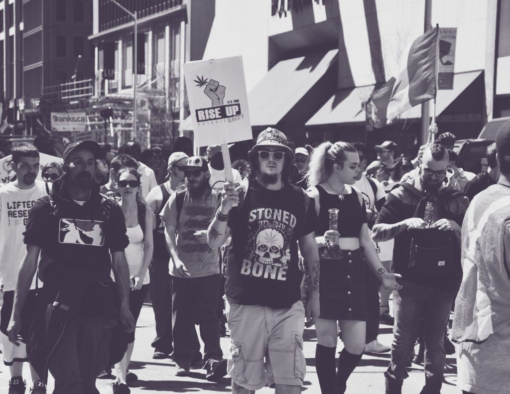
In Canada, the regulation of cannabis has roots in racist bigotry. In 1922, a well-known White Canadian feminist named Emily Murphy wrote a series of articles drawing attention to the evils of drugs like cannabis. In them, she associated drug use with “aliens of colour” who she believed were attempting to “bring about the degeneration of the White race.” Historically Canada’s approach to the regulation of cannabis has been excessive and overly punitive resulting in widespread negative impact that disproportionately harmed Black and Indigenous communities. Throughout the 20th century, activists fought to remove criminal penalties for cannabis possession, often at great personal risk. The protest culture that developed around cannabis activism is reflected in traditional counter-cultural symbology and iconography.
As cannabis became legal, brands began to intentionally move away from traditional cannabis counter-cultural symbology and iconography, using modernized imagery to appeal to the mainstream. As a result, modern cannabis branding has been captured by a sterilized “wellness” aesthetic. The lifestyle imagery associated with this aesthetic is predominantly White, female, thin and free from oppressive influences.
Like many activist organizations working in the cannabis space, we find his deeply problematic.
The dynamic and subversive history of cannabis activism in Canada has
been lost in this branding transformation
“Until recently, the negative branding of cannabis predominantly
looked like ‘the rastaman’ whereas the positive rebranding suddenly
looked like young, white people doing yoga at the park,” she says. “Cannabis has become a class signifier those who get to use, enjoy, and indeed, sell cannabis with ease look nothing like those who have historically been excluded from, and harmed by, the cannabis industry
and its laws.”
Vivianne Wilson, Canadian cannabis pioneer


In 2020, we teamed up multiple award-winning creative agency, Cossette, to re-launch our organization’s brand. We have intentionally stayed away from the a-histrical, modern “wellness” aesthetic that has become commonplace among cannabis brands today. We wanted the visual representation of our organization to acknowledge and pay homage to the sacrifice and struggle that characterized the path to legalization in Canada. Our logo is a hand-written rendition of our name. It represents our own roots: we started as a petition campaign before growing into an organization. Our bold and vibrant fonts depict a sense of urgency: freedom cannot wait. As we build the future of cannabis in Canada, we refuse to forget its past.